
SAN MIGUEL
E-COMMERCE
KEY HIGHLIGHTS
-
Worked closely with client realities and contingencies
-
Led the experience design of the entire platform (design, IA, copy)
-
In charge of the strategy and the execution of the user research
-
Worked closely with branding in order to find the balance between good UX practices and the creative vision
CASE STUDY: CREATIVITY + USABILITY
This case study focuses on our journey towards the first iteration of the platform. It highlights the challenges we took to balance both achieving the creative direction and adopting good UX practices for the website
Background
As we start doing more things digital, the demand for online shopping has never been higher
With so many choices online, experience is what sets us apart. This is why San Miguel, being the largest brewer of beer in the Philippines wanted to get a "fresh" take on their e-commerce platform and showcase their key selling points
Key selling points the company wanted to capture
Customers will assured to get cold drinks when ordering in the website
The site remembers past user purchases to save on time when they come back
Simple and seamless online buying experience
Challenge
How might we provide a strong e-commerce presence while staying true to the San Miguel brand experience?
Value Perspective
With an increasing demand for an easy digital purchasing experience as well as the company's tech savvy target audience, we were confident that this will provide value and will be used.
Feasibility Perspective
Looking at the existing user journey as well as the goal of the project, we determined that this was doable.
Usability Perspective
The challenge was finding the right balance between being able to stand out as a brand and having a stable and reliable user experience. The company wanted a "unique" take on e-commerce and we needed to make sure that users still understood how to use the system.
Viability Perspective
The company needed to improve an existing channel that wasn't living up to it's potential. Considering the power of e-commerce and the demand for a more convenient buying experience, this work is definitely a focus area for the company in order to bring in more revenue.
Big Idea
Overall redesign
We revisited the entire platform experience, analyzed what was worth keeping and what needed to be improved. The old platform was very dated in terms UX practices and we wanted to make sure we adapted to the new context. This meant using more familiar design patterns, responsiveness, and overall improved usability. We also added key features the client wanted to have
Focus on the branding
We the website wanted to align to the overall brand vision of the company so there was a lot of collaboration with our Creatives team on capturing the desired look and feel in order to have a bit of "wow" factor
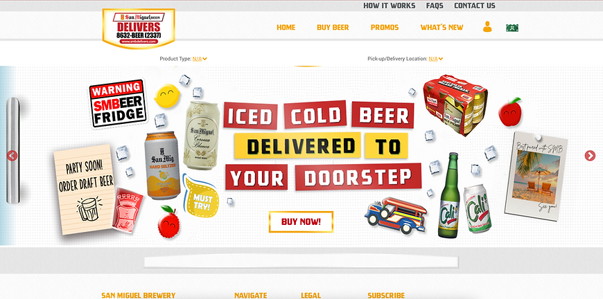
Freezer concept
As a key concept, we wanted to capture the "cold beer delivered to your doorstep" by implementing a "freezer" concept in the website. We added different magnets to emphasize this idea
Brand experience
The brand experience was very light and playful as it was to connect users to a happier and more fun vibe since beer is meant to be a drink used for celebrations, enjoyment, and connections
Ensuring usability
There were several iterations of this design since we wanted to flag that these magnets could be misunderstood as buttons. This is why we had to make sure the magnets were meant to complement rather than compete as well as establish the design system to make it clear which were buttons and which were not
Iterative Design
As we were developing the idea, creating the designs, I would consistently have check ins with the client, quick and dirty design tests for quick validation, and internal discussions to align
Key challenges

The client had third party partnerships for their distribution channels which at the time were very limited. This is why we established early on that there will be several phases to this solution. Initially we could only show them a list of locations and later on wanted this module to be smarter by using the users' location


There was a minimum number of drinks that users needed to fulfil. This was highlighted by our client in order to avoid delivering for only a small amount of items. We then had to accommodate for that parameter and visually show it in the design. We added a count in the UI and some validation message later in the flow to communicate this


As part of the pricing model, users can return used bottles which affect the total price. We then had to consider this when communicating to users how much their current cart is
What impact did this make?
Increase usage
The campaign generated a +336 increase in monthly user visits with 3x increase in average basket size.
More screenshots of the work

Wireframe

Production